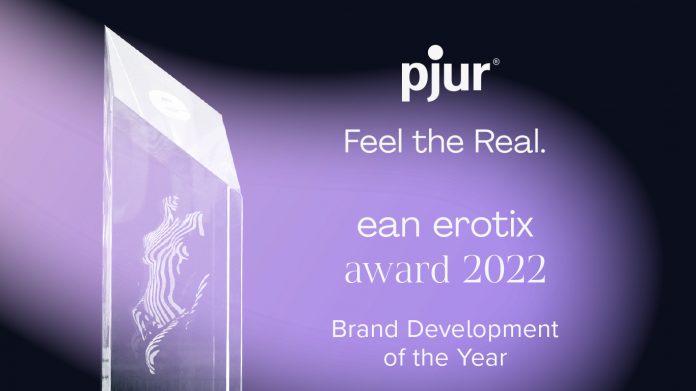
Premium lubricant manufacturer pjur was announced as the winner of the ean EROTIX Award for “Brand Development of the Year” at this year’s eroFame in recognition of its bold decision to take the brand in a new direction with a complete redesign.
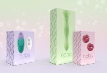
Yellow and black are the colors traditionally associated with pjur – but since the branding refresh, pjur has acquired a new logo, a new claim, new imagery and new colors. The new pjur logo retains the famous yellow dot but has been updated for a more modern and relevant look. This is supported by the claim “Feel the Real.”, which encapsulates the new values that pjur now wants to convey: self-determination and self-fulfilment. The new colour gradients of the fluid shapes in purple, blue, turquoise, yellow and red complete the established pjur colour spectrum and give the brand a fresh new aesthetic. The new shapes are a visual representation of diver- sity and openness, fascination, lightness and limitless dreams.
“We’re very pleased to receive this award, as it shows us that we’ve been on the right track with all the work we’ve done over the past two years to sharpen up the core brand message, values and aesthetic, as well as our future brand communication”, says Alexander Giebel, CEO & founder of pjur.
Explore the brand’s new look at: www.pjur.com.


